We love when data tells a story—and even more when it shows one. This beautifully layered population pyramid reveals how one Canadian community is evolving over time, with age-specific population estimates and projections in the period from 2000 to 2046. By visualizing demographic shifts across decades, we can better understand the challenges ahead—and the opportunities to adapt.

What the Chart Reveals
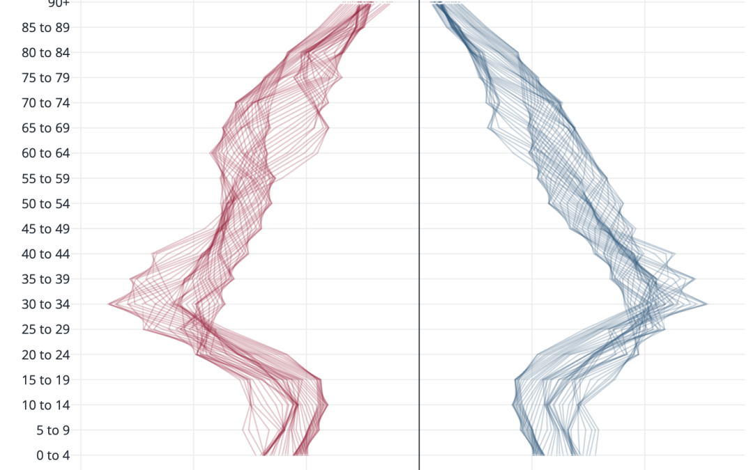
This chart displays population estimates and projections by 5-year age bands, separated by gender: females on the left (red) and males on the right (blue). Each line represents a different year, moving from past to projected future, creating a ripple or "wave" effect across time.
Here are the key insights:
🧓 The Senior Population Is Surging
The most notable trend is the steady and significant expansion in older age groups (65+). These segments fan outward over time, especially among females in the 75+ age brackets. This reflects the aging of the Baby Boomer generation and increasing longevity, particularly among women. It also signals growing demand for senior services, age-friendly infrastructure, and health care.
👶 Fewer Young Children Are Being Born
At the base of the chart, the age groups 0–14 remain narrow and relatively flat, indicating low birth rates and a gradually shrinking proportion of children. This has long-term implications for school enrolment, child care demand, and future workforce size.
👷 Working-Age Population Is Leveling Off
While not shrinking, the 20–64 age range is not expanding, especially compared to the growth among seniors. This means a rising dependency ratio—fewer people of working age relative to those who depend on public services. Strategic workforce planning and talent attraction will be critical going forward.
👩🦳 Gender Gap in Longevity
In the topmost age brackets (85+), females noticeably outnumber males, highlighting the well-known trend of longer life expectancy for women. This can inform planning for elder care services, housing, and social supports that are particularly relevant to older women.
📈 The “Mid-Life Bulge” Is Moving Up
A large cohort currently in their late 50s and early 60s is clearly visible as a bump in the chart. Over time, this group shifts upward into older brackets, signaling that the surge in senior population is not a short-term spike—but part of a long arc.
In Short
This BC community is seeing an aging population, low child population growth, and a steady but not expanding workforce base. These trends are not unique—but visualizing them this clearly helps build shared understanding and spark forward-thinking conversations.
Looking Ahead with Optimism
While these changes pose real challenges, they also unlock opportunities. Communities that invest in healthy aging, intergenerational connection, and workforce innovation will be best positioned to thrive. And with the right data at hand, they’ll be ready.
Get insights into your community's population outlook
Book a demo or contact us to learn how your community or region is projected to change.